BRAND | MERCURY FILMWORKS
Mercury goes further.
McMillan takes a world-class animation studio upmarket.
Challenge
Mercury Filmworks is an independent entertainment company that collaborates with partners like Disney and Netflix to produce exceptional creative content. They were developing a new brand, but had reached a dead end. Something was missing—but what?
Insight
As Mercury’s reputation as an industry-leading studio grew, they realized their existing brand sold them short. Their new brand needed to accurately reflect their position of influence among entertainment industry titans as the best animation content partner.
Solution
Rather than taking a light-hearted or comic approach, we developed a brand that had more in common with performance luxury brands like Mercedes and Louis Vuitton than other animation studios. We created a concise and authoritative voice as well as a refined visual identity system that expresses confidence, trust and creativity.
“While I’m delighted with the new BRAND, the most surprising benefit of McM’s guidance was gaining the ability to set out on paper a clear vision for who we are as a company and what drives us."
Clint Eland, President, Mercury Filmworks
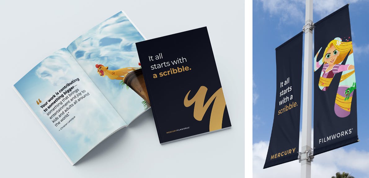
It all starts with a scribble.
That was the concept that Mercury had chosen as the guiding principle of its new brand identity. This was our starting point, too—we wanted the brand to demonstrate both the simplicity and elegance of a scribble.
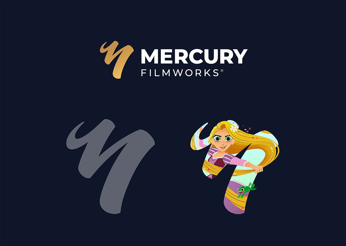
Mercury had already started the process when they engaged McMillan, with a “Scribble M” logo designed to epitomize quality and confidence. With “performance luxury brand” as our guide, we applied minor adjustments that made a major difference, rotating the shape by several degrees and refining the dimensions of the shape.
More significantly, we found innovative ways to use this primary mark, as well—a masked version of The Scribble M was developed to showcase Mercury’s creative work and give a sense of depth and dimension to print and online executions as well as executions throughout their corporate headquarters.
Logo


Colors
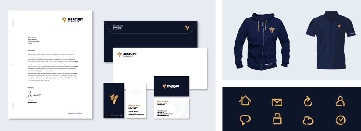
A gold-standard company needs a gold-standard colour palette. In the world of animation, where bright pops of primary colour are the norm, Mercury’s elegant palette, comprised of a regal navy blue and the Mercury Gold Gradient, further differentiated them from their peers.

Brand Expression
(Examples of how the new Mercury Filmworks brand came to life in the real world, print collateral etc. The design system in use. Bold, clean, consistent with a hint of playfulness, injection of MFW creative content balanced with the brand colours, font.)


Environment
One of the most important strategic considerations behind Mercury’s new brand was to recruit the top talent in the industry, and a large part of that was creating an inspiring creative workspace. We brought the brand into the physical spaces of the studio, and partnered with several well-known illustrators to create murals and artwork that reflected the energy and elegance of Mercury’s new brand.
