BRAND | OPORA
One Shape. One Color.
Endless Possibilities.
In the complex world of cybersecurity, McMillan helps Opora keep it simple.
Challenge
Opora approaches cybersecurity from a completely unique perspective—by stopping cyberattacks before they even happen. But they struggled to effectively express the value of this approach and how they execute it.
Insight
To differentiate Opora in an industry defined by its complexity and reliant on the same old symbology – shields, crosshairs – we needed to create a brand that was simple, original, yet flexible enough to convey complicated concepts like adversary behavior analytics.
Solution
A brandmark and design system composed of only one shape and one colour that could map out the complete story of what Opora does and how they do it.
The Mind Behind the Attack
Lots of cybersecurity providers offer fast detection and strategic response—but responding to cyberattacks after they occur is not a viable way for businesses to survive. Opora empowers its customers to know the mind behind the attack so that it can be stopped before it ever happens. This was the starting point for our new brand: to create a visual language that could live in both the digital and human world.
The Visual Brand
The foundational ideas behind Opora’s approach – seeing what others can’t, targeting adversaries, circumventing attacks and encircling adversaries – naturally leant themselves to a simple shape: the circle. (It didn’t hurt that the very name of the company is composed entirely of circular letterforms.) This confluence of circles became the basis for the logo, wordmark, and the design system as a whole. The result is a visual language that, despite its austere structure, is incredibly extensible.


The Design System
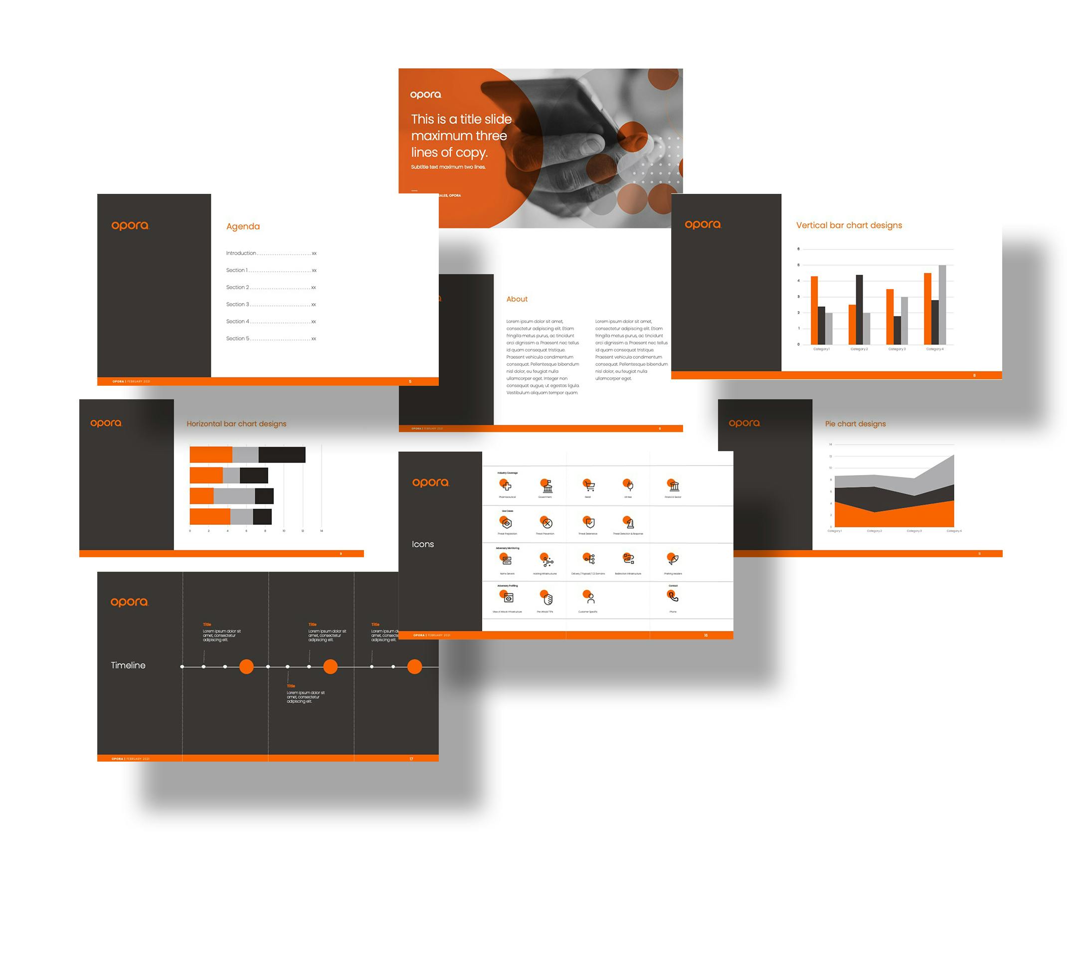
Opora’s simple patterns and textures – all of them composed of circular forms, symmetrical grids, and elementary color palette – capture the complexity and sophistication of the cybersecurity world in a crisp, clean, and straightforward way. The icon library – branded with the orange Opora circle – is purpose-built for simplicity, relying on basic shapes and metaphors. Black and white photographic treatments allow Opora to maintain the simplicity of the color palette while maintaining a distinct and obvious brand presence.

Photography

Icons


Powerpoint Template
