BRAND | HUB INTERNATIONAL
A fresh VIU
McMillan creates a consumer brand for
one of the world’s largest insurance brokerages.
Challenge
Personal insurance consumers want choice, but as a result of feeling overwhelmed, often go with the first policy they find, leading to a potential gap in coverage. As a result of growing demand for a better consumer experience – from point of purchase through claims – HUB International, a leading insurance brokerage, set out to create a new digital platform to provide options for consumers to purchase insurance that is personalized for their lives without sacrificing the advice and counsel only a professional can provide.
Insight
Extensive market research indicated that consumers were confused and intimidated by the complexities of the insurance industry. What they needed wasn’t better coverage—it was expert guidance to find the right coverage for them. They needed a better way to navigate through all the available options, with neutral advice about what to choose.
Solution
Working with some of the most innovative digital consultants and developers in North America, HUB developed a digital insurance brokerage platform that provides consumers with a choice of coverage options from multiple carriers alongside the counsel and unbiased advice of an expert team of insurance professionals who can protect them today, anticipate their needs, and guide them through tomorrow. To come fully to life, we created a memorable name and a dynamic, modern brand that would immediately make it clear that the world was about to get a fresh perspective on insurance.
“VIU by HUB empowers customers to find and purchase insurance and access advice however they wish. The McMillan team helped deliver a brand that reflects our intuitive and modern experience. It’s been rewarding and exhilarating to bring another brand to market together!”
Ellina Shinnick, CMO, HUB International
The Logo
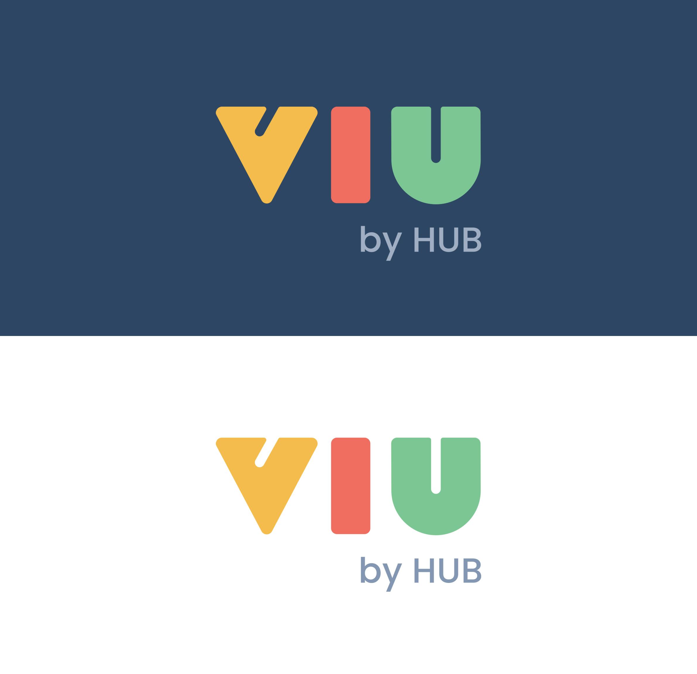
We started with a naming exploration and proposed VIU, a strikingly simple twist on the word view, which reinforced that core idea of a fresh perspective on insurance... and we added "by HUB" to add the endorsement of the master brand. Like HUB, VIU’s three-letter construction communicates simplicity. With slightly retro letter forms and three playful colors, the logo captures the feeling of delight that was inherent to the brand.

Shapes and Colors
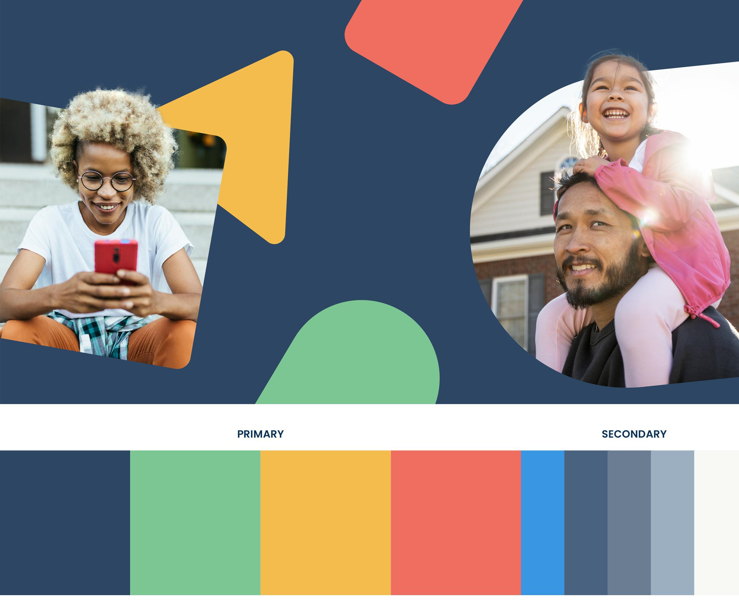
With a logo composed of simple shapes and primary colors, extending the visual design was a cinch. We used the brand shapes to create patterns and textures, and turned them into transparent frames that could be used in photography to visualize the protection having the right insurance gives you. The vivid color palette is purpose-built for accessibility and functionality within the platform.

Illustrations
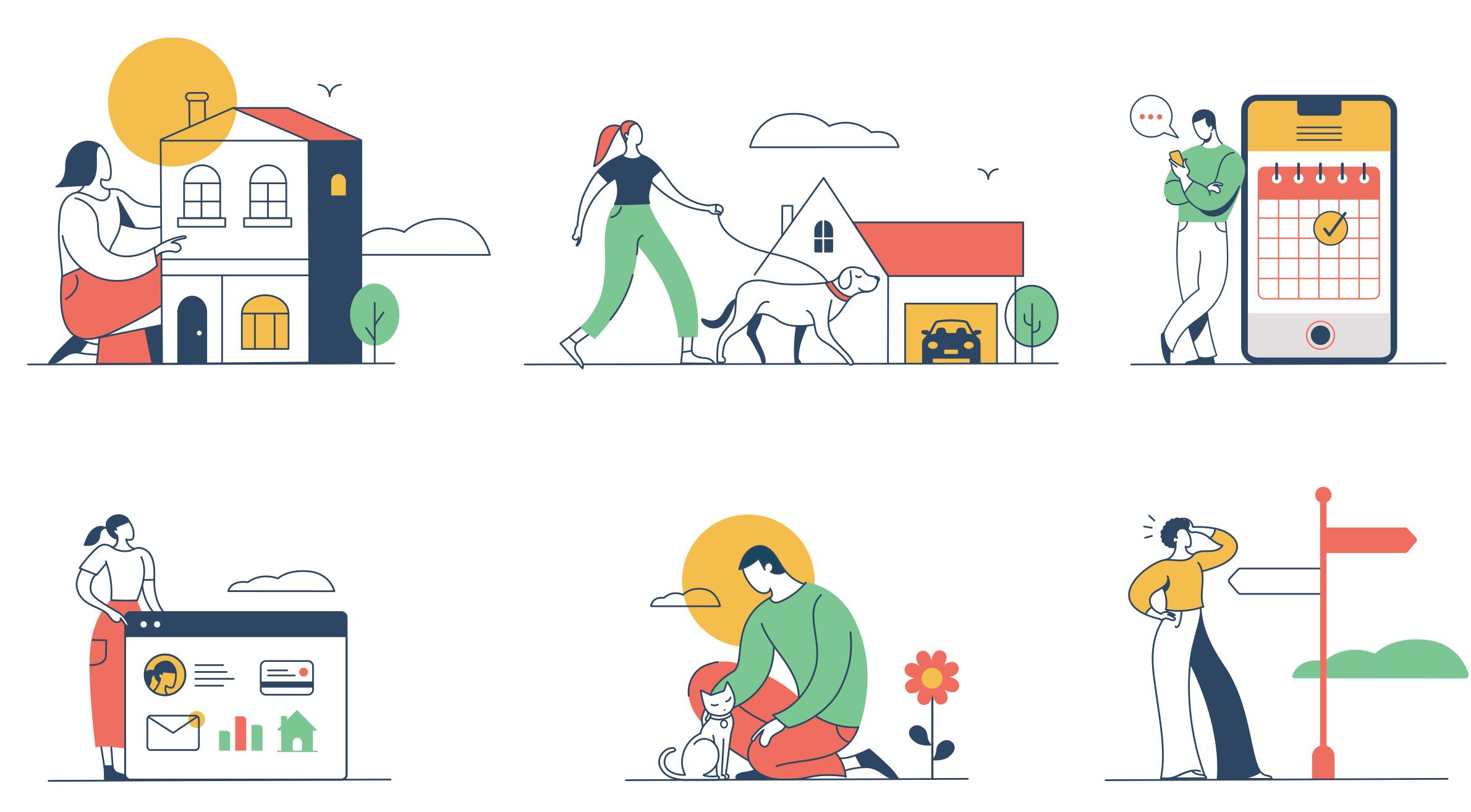
How can you make complex ideas seem intuitive and human? We developed a modern, colorful illustration style that was dynamic enough to be used in marketing material and within the platform itself.

Icons
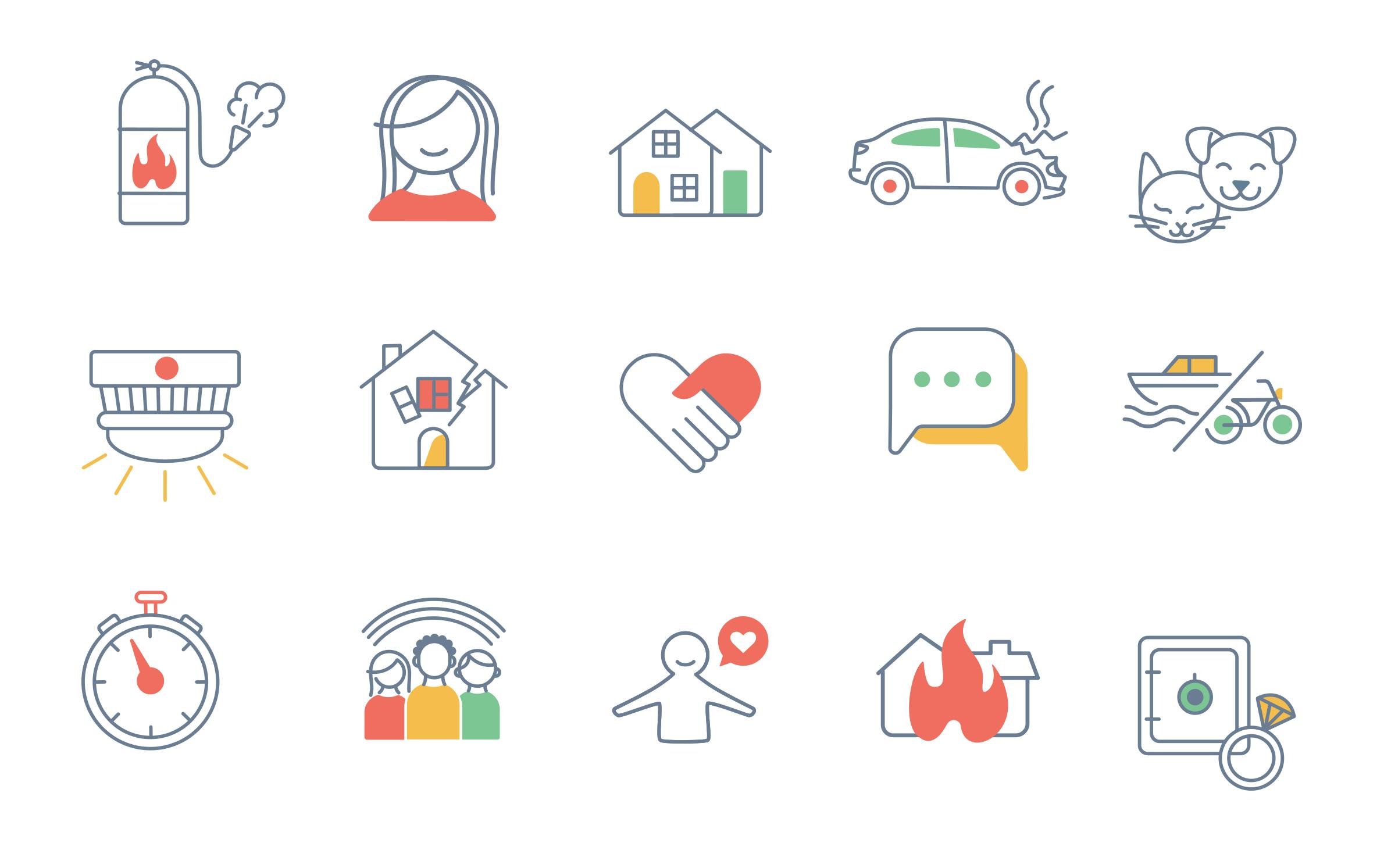
The library of bespoke icons are sleek and stripped-down, and feature details that reinforce the friendly nature of the brand: splashes of color, hearts, checkmarks, and smiles on all the faces (both human and animal).

Video Views on VIU
To capture the core ideas behind why HUB created VIU in the first place, we crafted this “Who we are” video for launch, with several shorter versions for social sharing.
And to provide a high-level overview of how delightful the VIU experience is for the consumer—and how dramatically different the experience is from any other service in the market—we followed up with this “How it works” video, again with cut-downed versions for social.
The Website
We worked closely with HUB’s long-time digital agency to provide them with all the brand direction and assets to create a website that truly embodied the VIU brand.