BRAND | DECISIVE
Decidedly
Decisive
McM merges two brands for national IT leader.
Challenge
In 2013, Decisive Technologies spun off cybersecurity entity BriteSky. Since then, organizations have changed the way they think about data management, and cybersecurity has become an integral part of their thinking. With both Decisive and BriteSky touching many of the same customers, it made sense to merge the two companies into one. The trick? How to do it without sacrificing brand equity, and create something new that was greater than the sum of its parts?
Insight
Rare is the organization that isn’t somewhere along the path to digital transformation. Equally rare are companies that don’t feel overwhelmed by the task of managing and protecting their data. Enterprises crave certainty from experienced data experts like Decisive—and research pointed us to four key pain points that organizations feel, and Decisive addresses: clarity; control; time; and confidence.
Solution
Taking our cue from those trigger words, we went bold and simple. Each term spawned a visual concept. The same bold simplicity carried over to the colour palette, while the brand photography was shifted from technology to users.
“MCMILLAN WAS INSTRUMENTAL IN REINVIGORATING OUR BRAND. THEIR TEAM HELPED US SIMPLIFY OUR MESSAGING AND ELEVATED OUR BRAND TO COMPETE ON A NATIONAL LEVEL.”
MITCHELL CARKNER, CEO, DECISIVE GROUP
Logo
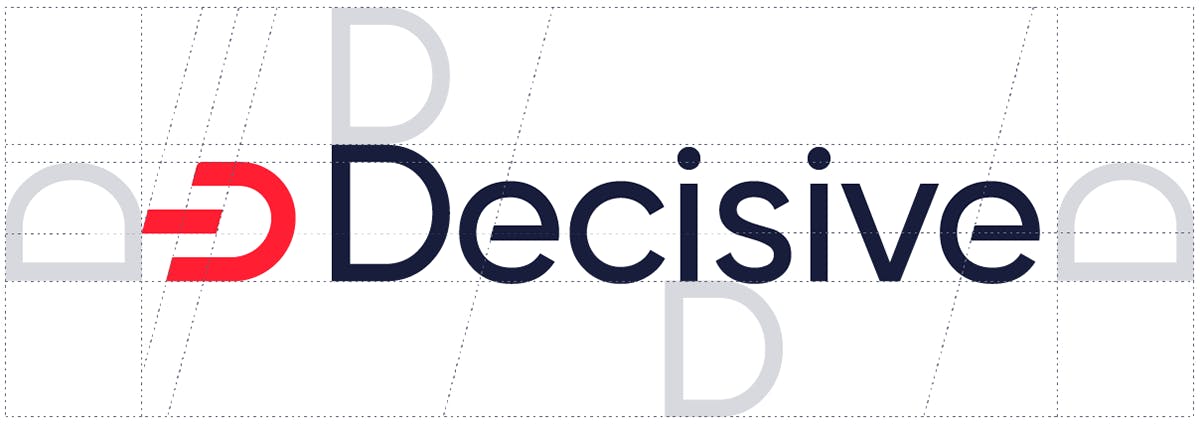
The Decisive logo is a bold, simple, uncomplicated symbol that clearly communicates the company’s new identity. The symbol is a letter “D”—leaning forward to express Decisive’s progressive take on infrastructure management, while protecting an interior piece of data. In addition, the stylized “D” makes obvious reference to the universal “power on” icon. The uniform thickness of the symbol and the wordmark conveys simplicity, solidy, and, well, decisiveness.


Colours
In line with the bold, clean, and strong theme, the Decisive colour palette—in particular the vibrant “Decisive Red”—is a powerful expression of the new brand. The use of a bright red, along with the deep, rich navy blue, also help differentiate Decisive from its competitors.

The Decisive Path
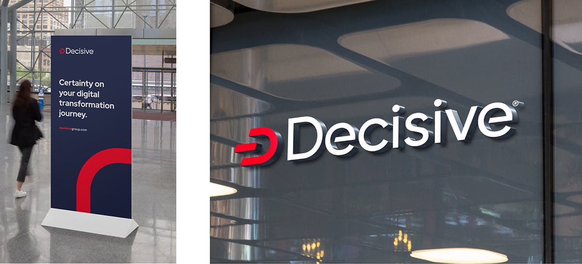
The symbol mark also inspired the Decisive Path line that symbolizes the clear path to security on the journey to digital transformation. It also offers the flexibility to be used with photography or with type alone.


3D Animation
Effective data management is all about movement—getting data from source points to the cloud, then back out to where it’s required; all while ensuring its integrity and protection. We created a vibrant, red ball to represent data, and then turned our imaginations loose.
Illustration
Our illustration and icon style is clear, conceptual, and unadorned, offering a number of options to enhance features and benefits, or to visually depict a process. The simple, vibrant, and bold colours are designed to complement the primary brand colours and our overall aesthetic. They scale well for placement in either large or small use cases.
Website
It all comes together on the Decisive site: the powerful, single-word headlines, bold colours, and motion graphics. The overall design aesthetic effectively conveys the message of clarity.
Brand Expression
The bold simplicity of our Decisive approach conveys a powerful message to the company’s customers and prospects, and allows the company to express itself effectively through any print or digital vehicle.


